
Working with HTML for images can be a real pain. Just when you think you have it nailed, the preview shows the images dropping to a new line.
Surprisingly, the HTML code to display images side by side is simple. What is not so easy is assigning captions to either a group of images or, applying captions to every image.
For that, we have HTML5 to rescue us as that introduces a couple of new elements. Figure and figcaption.
Both are relatively easy to work with unless you want captions with every image. That is when things get tricky.
Nothing is impossible though. With HTML, it is just a matter of using the right codes in the right places. To learn the codes, where to put them, and what each does, keep reading…
How to display images side by side in HTML
Margin-right and margin-left padding control the spacing between images in HTML. These can be added to the body section using an inline-block, or in the style section of your HTML document. Advanced users can apply CSS rules to the figure and figcaption elements to show images alongside captions.
The problem with images in a row with HTML
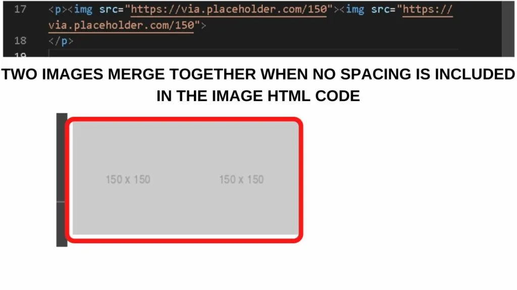
When you put your HTML codes for images side by side, there is no spacing placed between them.
How they appear on the screen is as though it is one complete picture. Not two or more.

To put some spacing between the images, padding needs to be added.
You can do this in one of two ways.
Method 1: Set the margins in your style section
Start in your HTML setup section at the very top of your document.
It will look like this.
|
1 2 3 4 5 6 7 8 9 10 11 12 |
<!DOCTYPE html> <html> <head> <meta charset="utf-8"> <meta name="viewport" content="width=device-width, initial-scale=1"> <title>How to Align Images Side by Side in HTML</title> <style> </style> </head> <body> </body> </html> |
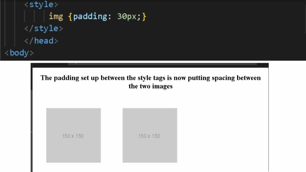
Between the two style tags is where to add padding to your images. In HTML, spacing is called “padding”.
|
1 |
img {padding: 30px;} |

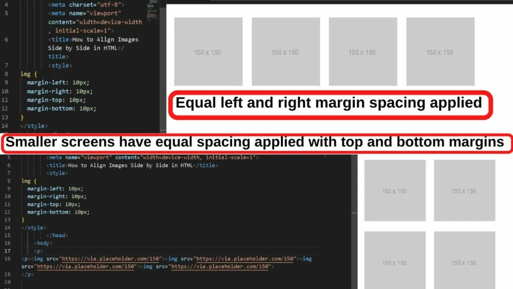
Different margins can be applied to the left, right, top, and bottom margins.
|
1 2 3 4 5 6 7 8 |
<style> img { margin-left: 30px; margin-right: 60px; margin-top: 40px; margin-bottom: 50px; } </style> |
Where these come in handy is if you have your images pushing up too close to the paragraph above or below the images.
Setting the margin-bottom higher increases the space between the image and the next paragraph.
Likewise, the margin-top controls the spacing between the previous paragraph ending and the images starting.
The margin-left and margin-right are what control the spacing between images next to each other in HTML.
Specifying the size of spacing for all margins is important for responsive web design. Especially if you are placing more than a few images side by side because in mobile view, they will become stacked.
Without specifying a top and bottom margin, images will be really close together on small screens.

Method 2: Display images side by side with inline HTML
Inline HTML just means that you are altering the image HTML directly in the body section of your HTML document. A universal style attribute is not set.
Inline HTML is done using the style element wrapped within the IMG source code.
Like this:
|
1 |
Style=”float: left; margin-right: 5%; margin-bottom: 1em;”> |
That code needs to be repeated for every image you want to show side by side.
|
1 2 |
<p><img src="https://via.placeholder.com/150" style="float: left; margin-right: 5%; margin-bottom: 1em;"><img src="https://via.placeholder.com/150" style="float: left; margin-right: 5%; margin-bottom: 1em;"><img src="https://via.placeholder.com/150" style="float: left; margin-right: 5%; margin-bottom: 1em;"><img src="https://via.placeholder.com/150" style="float: left; margin-right: 5%; margin-bottom: 1em;"> </p> |
Notice how the style element is applied to every image source? You can do this as often as you need to and no line breaks will be required.
When screen space runs out, the next image drops below the image with the margin-bottom applied to keep them spaced apart.

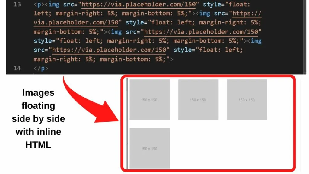
What the above code is doing is floating each image to the left of the previous one until the screen space runs out. Once it does, the next image drops to the next line and applies the margin rule for the bottom padding.
Once you are done with the images though, the float style element may still be applied. It is best to clear this to prevent your text from floating to the right of the image.
|
1 |
<p style="clear: both;"></p> |
The “clear: both” is inserted after your last image. You can then add the p tag to begin a new paragraph.
How to use Figure and Figcaption attributes to show images side by side in HTML5
HTML5 introduced two new elements to use with images. Figure and figcaption.
Figure and figcaption are self-contained units, so when you place the HTML code side by side, the images drop to a new line.
To style images side by side, you can either assign a single figcaption or style a section with CSS.
Both methods are outlined below.
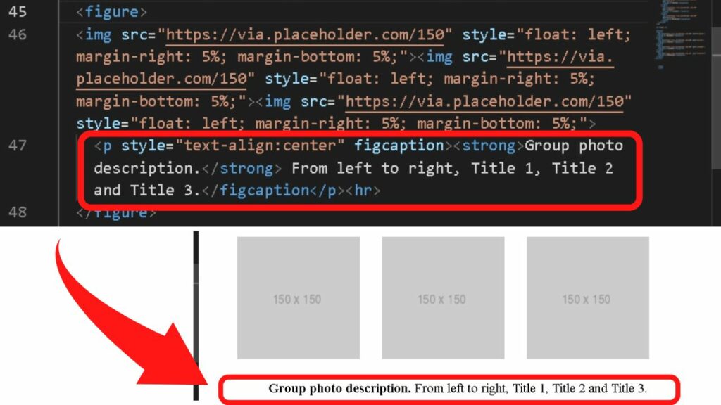
Method 1: Make a row of images side by side with a single figcaption
Assigning a caption to a group of photos is done by wrapping all of your images in a single figure container, then placing a figcaption to describe the images.
Step 1: Open the image group with the figure element
This goes in the body section of your HTML document before the image source code.
|
1 |
<figure> |
Step 2: Add your image source codes
Inline HTML is applied here to align the images side by side.
The figcaption goes inside the figure container.
|
1 2 3 4 |
<figure> <img src="https://via.placeholder.com/150" style="float: left; margin-right: 5%; margin-bottom: 5%;"><img src="https://via.placeholder.com/150" style="float: left; margin-right: 5%; margin-bottom: 5%;"><img src="https://via.placeholder.com/150" style="float: left; margin-right: 5%; margin-bottom: 5%;"> <p style="text-align:center" figcaption><strong>Group photo description.</strong> From left to right, Title 1, Title 2 and Title 3.</figcaption</p><hr> </figure> |
As the figcaption is text, you can also apply style attributes such as aligning the text to the center, as is shown in the above sample HTML.
The result is a group of images showing side by side with a single caption centered below the images.

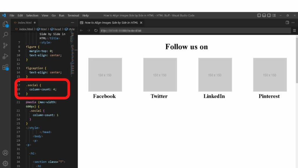
Advanced: Applying a figcaption to all images side by side in HTML and CSS
CSS can be applied to the style section of your HTML document.
That is this:
|
1 2 |
<style> </style> |
Step 1: Set the style elements for the figure and figcaption blocks
The first part is to assign style values for the figure element and the figcaption.
|
1 2 3 4 5 6 7 |
figure { margin-top: 0; } figcaption { text-align: center; } |
The code above is going to remove spacing between the image and the caption, and the caption will be centered.
Step 2: Create a column section
A basic column is done by creating a class container and assigning a column count.
|
1 2 3 |
.social { column-count: 4; } |
Replace “social” with an easier name for you to remember. What you place after the period (.) is the class name you will use later to call up the section in the body of your document.
The above setup results in a 4-column layout with images side by side and a caption beneath each. You can set the number of columns to whatever you need.

More can be done to style your columns within this section. To learn more on that, see our tutorial – How to add columns in HTML.
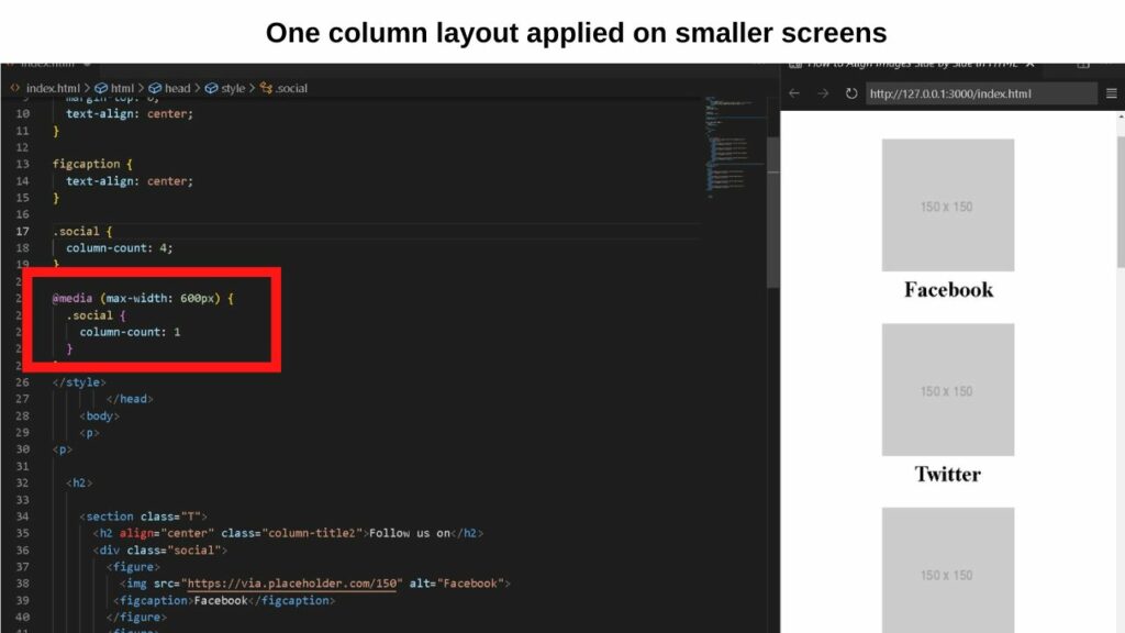
Step 3: Set a lower column number for smaller screens
The @media value is used to apply rules for the specified values. As the column count is set to 4, it is too wide for a small screen to show.
To address that, you can specify a lower column count for smaller screen sizes.
|
1 2 3 4 |
@media (max-width: 600px) { .social { column-count: 1 } |
Now, the column layout changes from four to one when the page loads on a screen that is incapable of showing more than 600 pixels.

Piecing it altogether
With the style elements set, the last piece of the puzzle is calling up the section.
Do that by opening a div section in the body of your document.
|
1 |
<div class="social"> |
Whatever name you assigned after the period (.) in the style section is the class name to include here.
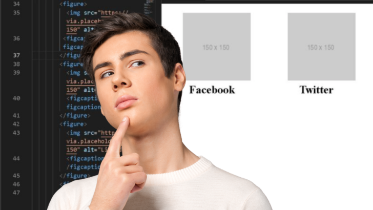
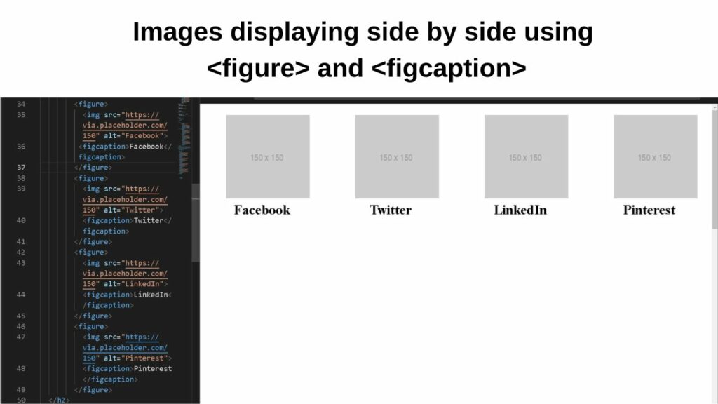
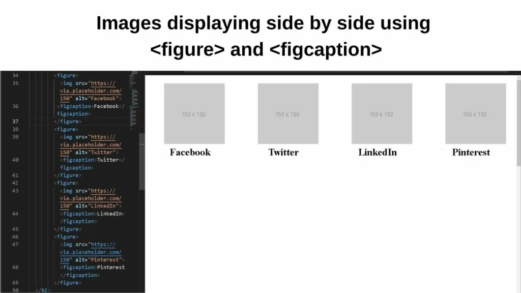
Next, open the figure element, then include all of your image sources, apply alt attributes and give each image a figcaption.
|
1 2 3 4 5 6 7 8 9 10 11 12 13 14 15 16 |
<figure> <img src="https://via.placeholder.com/150" alt="Facebook"> <figcaption>Facebook</figcaption> </figure> <figure> <img src="https://via.placeholder.com/150" alt="Twitter"> <figcaption>Twitter</figcaption> </figure> <figure> <img src="https://via.placeholder.com/150" alt="LinkedIn"> <figcaption>LinkedIn</figcaption> </figure> <figure> <img src="https://via.placeholder.com/150" alt="Pinterest"> <figcaption>Pinterest</figcaption> </figure> |
Now, all the images will be displayed side by side with a caption assigned to each.
The exception is for smaller screens because the @media rule is set (or should be set) to show only one column on smaller screens.