

Centering elements within a div is a common task in web development.
Most developers implement this feature on their projects, especially when focusing on the general End-User Experience (UX):
This post will give you a comprehensive guide on how to center various HTML elements inside a Div tag. These include images, tables, lists, and other div tags.
Let’s now look at how to center each element in a HTML div tag.
How to Center a Div Inside a Div
You can center a div inside another div using HTML and CSS by using the following steps:
Create a parent div element in your HTML and give it a unique ID or class.
|
1 2 3 |
<div id="parent"> <!-- Child div goes here --> </div> |
Create a child div element inside the parent div and add your content to it.
|
1 2 3 4 5 |
<div id="parent"> <div id="child"> <!-- Content goes here --> </div> </div> |
In your CSS, use the ID or class of the parent div to specify its width, height and display property.
|
1 2 3 4 5 6 7 |
#parent { width: 1024px; height: 720px; display: flex; background-color: skyblue; align-items: center; justify-content: center; } |
The above CSS sets the parent div to have a width of 80% of the viewport, a height of 400 pixels, and a display property of flex.
The align-items and justify-content properties are set to center, which will center the child div both vertically and horizontally within the parent div.
If you want to style the child div further, use its ID or class in your CSS as shown in the code below.
|
1 2 3 4 5 6 |
#child { width: 50%; height: 250px; background-color: gray; text-align: center; } |
When you open this code on your browser, you should see a similar output to the image below.


How to Center an Image Horizontally Inside a Div
You can center an image inside a div in HTML and CSS by using the following steps:
Create a div element in your HTML and give it a unique ID or class.
|
1 2 3 |
<div id="container"> <!-- Image goes here --> </div> |
Add an img element inside the div and specify the source of the image using the src attribute.
|
1 2 3 |
<div id="container"> <img src="your-image-source.jpg"> </div> |
In your CSS, use the ID or class of the div to specify its width, height, and text-align property.
|
1 2 3 4 5 6 |
#container { width: 80%; height: 400px; text-align: center; background-color: skyblue; } |
The above CSS sets the div to have a width of 80% of the viewport, a height of 400 pixels, and a text-align property of center.
This will center the image both horizontally and vertically within the div.
To further style the image, you can use the img element in your CSS.
|
1 2 3 4 5 6 |
img { display: block; margin: 0 auto; width: 50%; height: auto; } |
The display property is set to block, which will cause the image to occupy the full width of its parent container.
The margin property is set to 0 auto, which will add equal margins to the top and bottom of the image and center it horizontally within the div.
The width: 50% CSS property sets the width of the image to 50% of its parent container’s width.
In this case, since the parent container is #container, the width of the image will be 50% of #container’s width, which is set to 80% of the viewport width.
The height: auto property sets the height of the image to be automatically calculated based on its aspect ratio.
This means that if the aspect ratio of the image changes, the height will automatically adjust to maintain the aspect ratio.
Using the “auto” property instead of directly hard coding a fixed size for the image is quite good for responsive web design.

Alternatively, you can still use `Flexbox to center an image in a div by tweaking the CSS styling above as shown below.
|
1 2 3 4 5 6 7 8 9 10 11 12 13 |
#container { width: 80%; height: 400px; background-color: skyblue; display: flex; align-items: center; justify-content: center; } img { width: 50%; height: auto; } |
In this version, the #container element has display: flex set, which makes it a flex container. The align-items property is set to center, which centers the items along the cross axis (vertically in this case).
The justify-content property is set to center, which centers the items along the main axis (horizontally in this case).
The img element no longer needs the display: block and margin: 0 auto properties, since it is being centered by the Flexbox properties set on the parent #container element.
The width: 50% and height: auto properties remain the same, since they control the size of the image.
How to Center a List Inside a Div
Create a div element in your HTML and give it a unique ID or class.
|
1 2 3 |
<div id="container"> <!-- List goes here --> </div> |
Add an unordered or ordered list inside the div.
|
1 2 3 4 5 6 7 |
<div id="container"> <ul> <li>List item 1</li> <li>List item 2</li> <li>List item 3</li> </ul> </div> |
In your CSS, use the ID or class name of the div to specify its width, height, and text-align property. We will also set a background color for better visibility.
|
1 2 3 4 5 |
#container { width: 80%; height: 400px; text-align: center; background-color: red; } |
The above CSS sets the div to have a width of 80% of the viewport, a height of 400 pixels, and a text-align property of center. This will center the list both horizontally and vertically within the div.
To further style the list, you can use the ul element in your CSS.
|
1 2 3 4 5 6 7 |
ul { padding: 0; list-style: none; display: inline-block; margin: 0 auto; font-size: 2em; /* For better visibility */ } |
The list-style property is set to none, which will remove the default bullet points from the list.
The display property is set to inline-block, which will cause the list to be treated as an inline-level block container (i.e., placed inline with text).
The margin property is set to 0 auto, which will add equal margins to the top and bottom of the list and center it horizontally within the div.
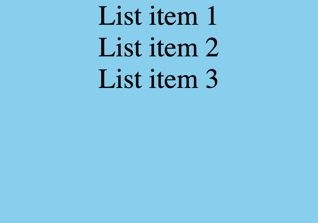
When you open this code on your browser, you should see an output similar to the image below.
Alternatively, instead of using the text-align:center and display:inline-block styling, you can use flex box to center a list inside a div as shown below.$
|
1 2 3 4 5 6 7 8 9 10 11 12 13 14 |
#container { width: 80%; height: 400px; background-color: red; display: flex; align-items: center; justify-content: center; } ul { padding: 0; list-style: none; font-size: 2em; /* For better visibility */ } |
Here, the #container element has display: flex set, which makes it a flex container. The align-items property is set to center, which centers the items along the cross axis (vertically in this case).
The justify-content property is set to center, which centers the items along the main axis (horizontally in this case).
Note: The ul element does not need the display: inline-block and margin: 0 auto properties since they are not needed when using flexbox.
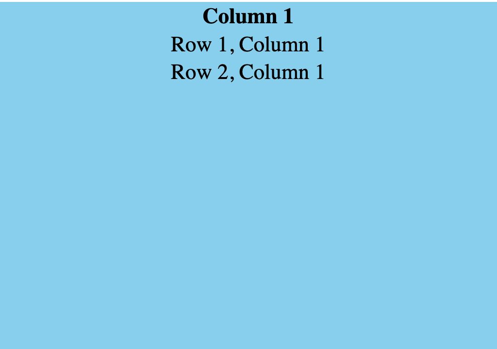
How to Center a Table Inside a Div
You can center a table inside a div in HTML and CSS by using the following steps:
Create a div element in your HTML and give it a unique ID or class.
|
1 2 3 |
<div id="container"> <!-- Table goes here --> </div> |
Add a table inside the div.
|
1 2 3 4 5 6 7 8 9 10 11 12 13 |
<div id="container"> <table> <tr> <th>Column 1</th> </tr> <tr> <td>Row 1, Column 1</td> </tr> <tr> <td>Row 2, Column 1</td> </tr> </table> </div> |
In your CSS, use the ID or class of the div to specify its width, height, and text-align property.
|
1 2 3 4 5 6 |
#container { width: 80%; height: 400px; text-align: center; background-color: skyblue; } |
The above CSS sets the div to have a width of 80% of the viewport, a height of 400 pixels, and a text-align property of center. This will center the table both horizontally and vertically within the div.
To further style the table, you can use the table element in your CSS.
|
1 2 3 4 |
table { margin: 0 auto; border-collapse: collapse; } |
The margin property is set to 0 auto, which will add equal margins to the top and bottom of the table and center it horizontally within the div.
The border-collapse property is set to collapse, which will remove the space between cells and create a seamless border around the table.
When you open this code on a browser, you should see an output similar to the image below.

Alternatively, you can still use Flexbox to center a table inside a div with a few little changes to the previous CSS styling.
|
1 2 3 4 5 6 7 8 |
#container { width: 80%; height: 400px; background-color: skyblue; display: flex; align-items: center; justify-content: center; } |
In this version, the #container element has display: flex set, which makes it a flex container. The align-items property is set to center, which centers the items along the cross axis (vertically in this case).
The justify-content property is set to center, which centers the items along the main axis (horizontally in this case).
|
1 2 3 |
table { border-collapse: collapse; } |
The table element no longer needs the margin: 0 auto property, since it is being centered by the Flexbox properties set on the parent #container element.
Now, before we wrap this up, let’s finish things up with a short summary on all the contents that we treated in this article:
How to Center Divs, Images, Tables and Lists inside a Div Tag
You can center a div, image, table or list inside a parent div using HTML and CSS using any of the methods below.
- Using the “text-align: center” property for the parent div.
- Setting the child element’s “margin-left” and “margin-right” properties to “auto” and its “display” property to “block”.
- Using the “flexbox” layout by setting the parent div’s “display” property to “flex” and its “justify-content” and “align-items” properties to “center”.
- Using the “grid” layout by setting the parent div’s “display” property to “grid” and its “justify-items” and “align-items” properties to “center”.
Frequently Asked Questions on How to Center Divs, Images, Tables and Lists inside a Div
What is the margin:0 auto; CSS property?
The margin: 0 auto CSS property sets the top and bottom margins of an element to 0 and the left and right margins to auto. This is often used to center an element horizontally within its container.
What is the different between justify-content:center; and align-items:center; CSS Properties.
The justify-content Flexbox property is used to align elements along the main axis of a Flexbox container. The main axis is the direction in which elements are laid out and can be either horizontal (left-to-right) or vertical (top-to-bottom).
The align-items Flexbox property is used to align elements along the cross axis of a Flexbox container. The cross axis is perpendicular to the main axis and can be either horizontal (left-to-right) or vertical (top-to-bottom).