

Columns are helpful in HTML because they allow you to divide a webpage into multiple vertical sections, which can present content in a more visually appealing and organized way.
That can be especially helpful when you have a lot of content that you want to present in a way that is easy for users to scan and read.
Using columns in HTML can also make it easier to create responsive designs, as you can use columns to adjust the layout of your content depending on the size of the screen or device on which it is being viewed.
How to Make 2 Columns in HTML
There are several ways to create 2 columns in HTML. You can create two <div> elements in your HTML and then style them using the CSS float property or the CSS Flexbox (display: flex). Alternatively, you can use the HTML <table> element to create two columns on your website.
This post will give you a comprehensive guide on How to make two columns in HTML using all the methods listed above.
1. Create Two Columns in HTML with CSS float Property
First, create a <div> tag inside your HTML and give it a class name of “row.” This <div> tag will be the parent element that will hold the two columns you want to create. In this particular tutorial, we want to create the two columns shown in the image below.

Inside the <div class=”row”> tag, create two other <div> tags and give them a class name of “column.” You would need to create more div tags if you wanted more than two columns. However, we only need two columns for this post.
The resulting HTML code should look similar to the code snippet below.
|
1 2 3 4 5 6 7 8 9 10 11 12 13 14 15 16 17 |
<html> <head> </head> <body> <div class="row"> <div class="column" style="background-color: red">COLUMN 1</div> <div class="column" style="background-color: green">COLUMN 2</div> </div> </body> </html> |
You can add the background-color style to the div elements inside the <div class=”column”> tag, as shown in the code above. That will enable you to easily differentiate the two columns when viewed on the browser.
Next, you will need to style the elements using CSS, as shown below.
|
1 2 3 4 5 6 7 8 9 10 11 12 13 14 15 16 17 18 19 20 21 22 23 |
<style> .column { float: left; width: 50%; height: 200px; } .row:after { content: ""; display: table; clear: both; } </style> |
Let’s look at the CSS properties used for the <div class=”column”> tag.
- float: left – The float property in CSS is used to specify how an element should float (i.e., be positioned) within its parent element. The float: left property in this case will align the two columns horizontally with the first div being the first column and the second div as the second column.
- width: 50% – This property will make each column occupy 50% width of the parent element (<div class=”row”>) creating two equal columns. You can change this setting if you want one column to be bigger than the other.
- height: 200px – This is an optional property and it’s only used in this post so that you can see the columns much more clearly.
Let’s look at the CSS properties used for the <div class=”row”> tag.
First, you will notice that we are calling this div using the class name .row::after. The after pseudo-element in CSS allows you to insert content after an element. It is often used to add decorative elements to a page or to create particular layouts.
- content: “” – The content property is used to specify the text that will be inserted after the element with the class element. In this case, we are not inserting anything.
- display: table – When an element has a display value of table, it is rendered as a table element. This means that the element will behave like an HTML table element and will be treated as a block-level element. Note that the display property can take other values such as block, inline, flex, and grid, among others.
- clear: both – The clear: both CSS property is used to specify that an element should not be positioned alongside floated elements. In this case, we don’t want any element to appear alongside our “floated” columns.
Create Two Columns in HTML with CSS Flexbox
To create two columns using CSS flexbox, you can use the following steps:
- First, you need to create a div that will act as a container for the two columns. For this post, we will create a div and give it a class name of “container” – <div class=”container”>.
- Add child elements to the container which will become the columns. In this post, we will create two div tags and give them a class name of “column” – <div class=”column”>.
Up to this point, your HTML should look something similar to the code snippet below.
|
1 2 3 4 5 6 7 8 9 10 11 12 13 14 15 16 17 18 19 20 21 22 23 24 25 26 27 28 29 30 31 32 33 34 35 36 37 |
<html> <body> <div class="container"> <div class="column" style="background-color: grey"><h1>Column 1</h1></div> <div class="column" style="background-color: yellow"><h1>Column 2</h1></div> </div> </body> </html> Now add the CSS styles as shown below. <style> .container { display: flex; flex-direction: row; } .column { flex: 50%; height: 500px; } </style> |
Let’s have an in-depth look at the styles applied to the <div class=”container”> element.
- display: flex property – This property will make the container a flex container and allow you to use flexbox layout for its child elements. By default, this property will align the child elements (columns) horizontally.
- flex-direction: row – This property will align the items horizontally inside the container. However, you can omit this line as the default flex direction always “row.”
Let’s have an indepth look at the styles applied to the child elements – <div class=”column”>.
- flex: 50% – This property specifies the size of each column. In this case, we are specifying each column to have a width of 50%. That will give us two equal columns.
- height: 500px – This is an optional property and we are only using it so that you can see the columns on the web page clearly.
When you open that HTML code on the browser, you should see two columns similar to the image below.

3. Create Two Columns in HTML Using Tables
To create two columns in HTML using tables, you can use the <table> element to define the table, and then use the <tr> element to define a row in the table.
Within the row, you can use the <td> element to define a cell in the table, and place your content within the cell.
Here’s an example of how you could create a two-column table in HTML:
|
1 2 3 4 5 6 7 8 9 10 11 12 13 14 15 16 17 18 19 20 21 |
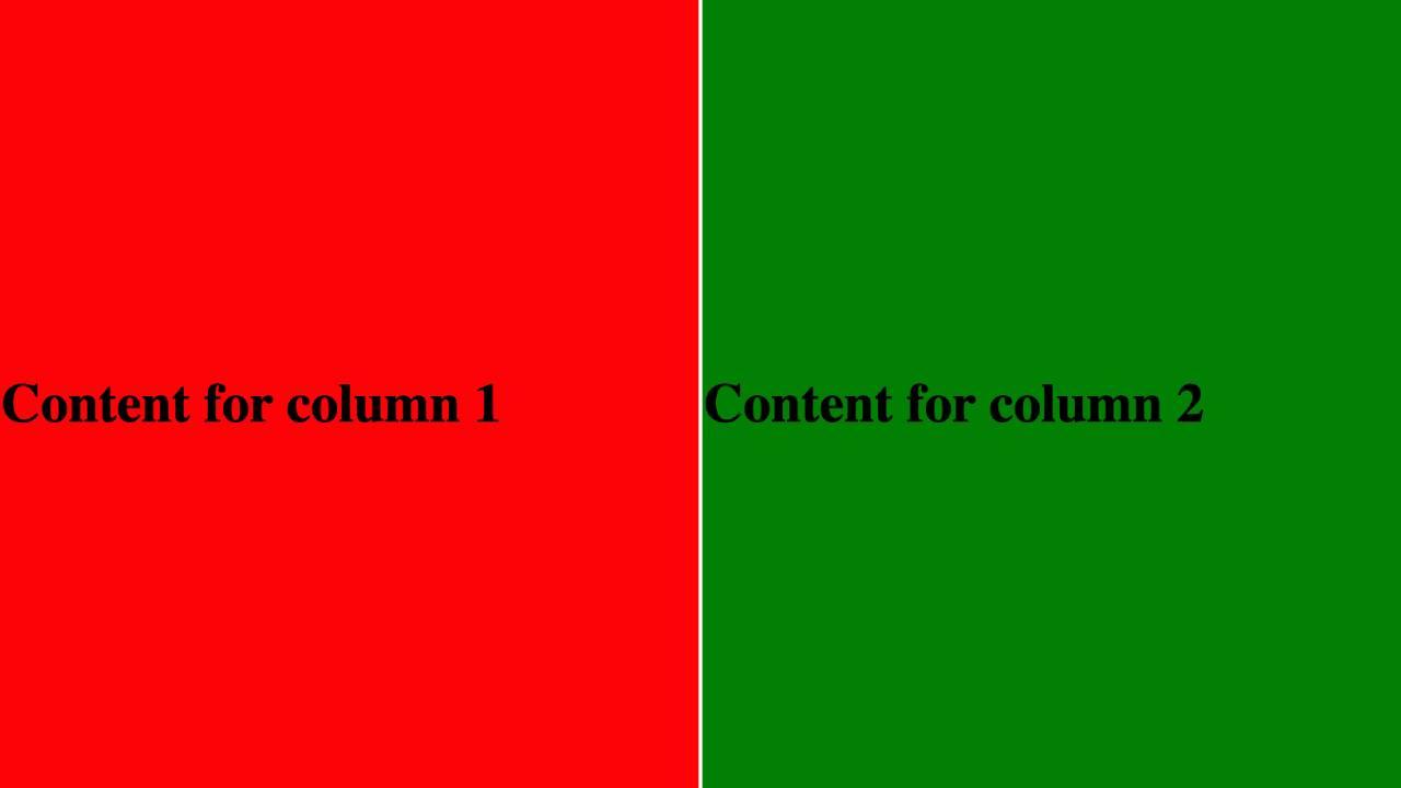
<html> <head> </head> <body> <table> <tr> <td style="background-color:red"><h1>Content for column 1</h1></td> <td style="background-color:green"><h1>Content for column 2</h1></td> </tr> </table> </body> </html> |
For better visibility, let’s add some CSS styling.
|
1 2 3 4 5 6 7 8 9 10 11 12 13 14 15 16 17 |
<style> table { height: 500px; width: 100%; } td { width: 50%; } </style> |
First, we are giving the entire <table> element a height of 500px (height: 500px) and a width of 100%. The width property (width: 100%) will make the table occupy the whole screen of your device from left to right.
Next, we add the width: 50% property to the <td> element. This property will apply a width of 50% to every column thus creating two equal columns.
When you open this code on a browser, you should see an output similar to the image below.
Frequently Asked Questions about How to make 2 columns in HTML
Can I create columns using pure HTML, or do I need to use CSS?
If you are creating columns using the <table> tag, HTML alone would be enough. However, if you want to use the float property described in method 1 or CSS Flexbox described in method 2 – you will need to use CSS.
Can I specify the width of each column individually?
Yes! You can specify the width of each column in your CSS styling. However that means every column will have its own unique class name.
Can I nest columns within columns to create a multi-column layout html?
Yes, it is possible to nest columns within columns to create a multi-column layout in HTML. However, deep nesting is not recommended as it would lead to mobile-responsive issues and results in unattractive text flows.